Ginkgo
Converting e-learning users from free to premium
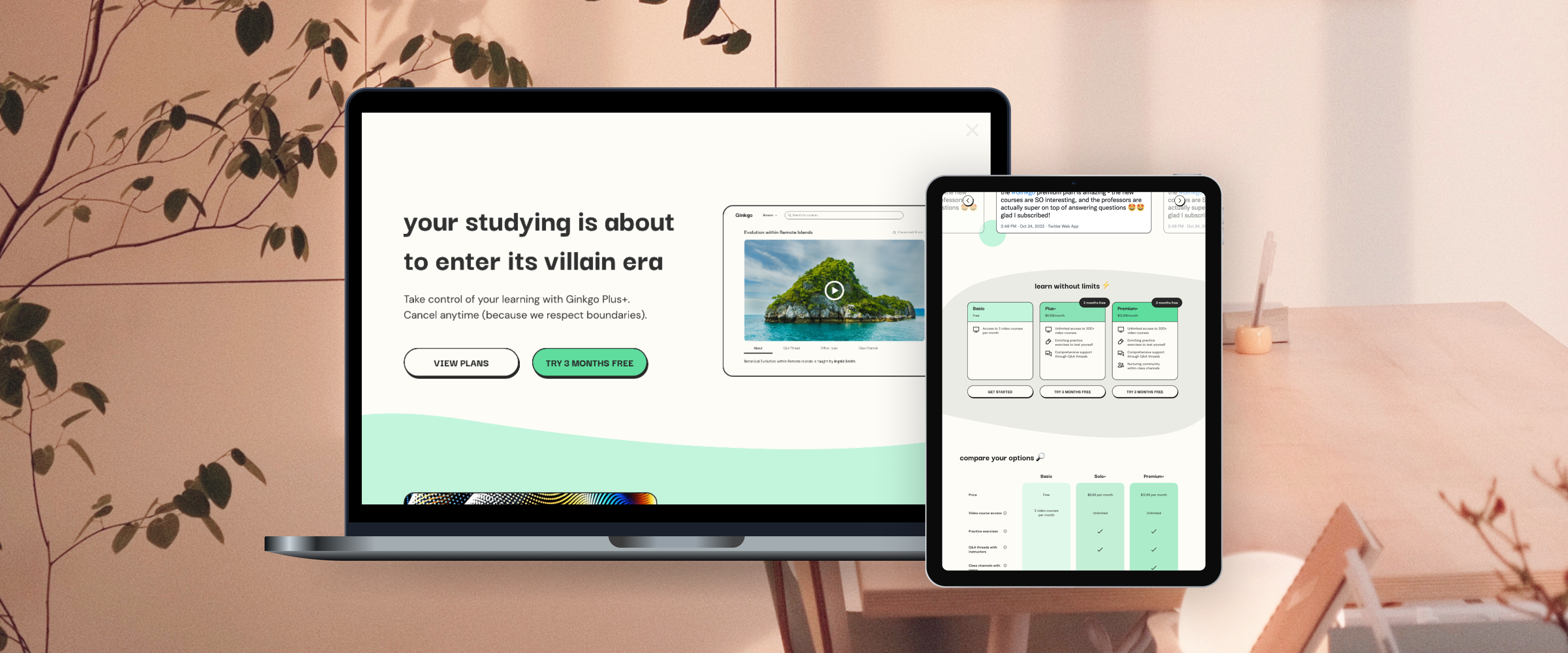
"Ginkgo" is the study of a freemium e-learning company. The company provides video courses to help college students excel in their classes. It offers a free product to start and a premium product with greater benefits. The goal is to convert users from free to premium.
Context
Team
1 designer, 1 senior design mentor
Responsibilities
As the sole designer, I was responsible for user research, brand design, UX and UI design, and usability testing, and iterations. Senior designer Ana Massette advised on my deliverables, but the work was my own.
Timeline
8 weeks (Fall 2022)
The Problem
How might we encourage users to upgrade to premium during the sign-up flow and while using the free product?
Through my research, I found that users aren't always enticed to go premium. Sometimes, there is no convincing reason to upgrade. There is also often no effective call to action (CTA) to upgrade while signing up, or while using the free product.
The Solution
1) Make it relatable.
A few ways I related to my users was speaking their language (Gen Z slang), and showing concern for the main issues they face.
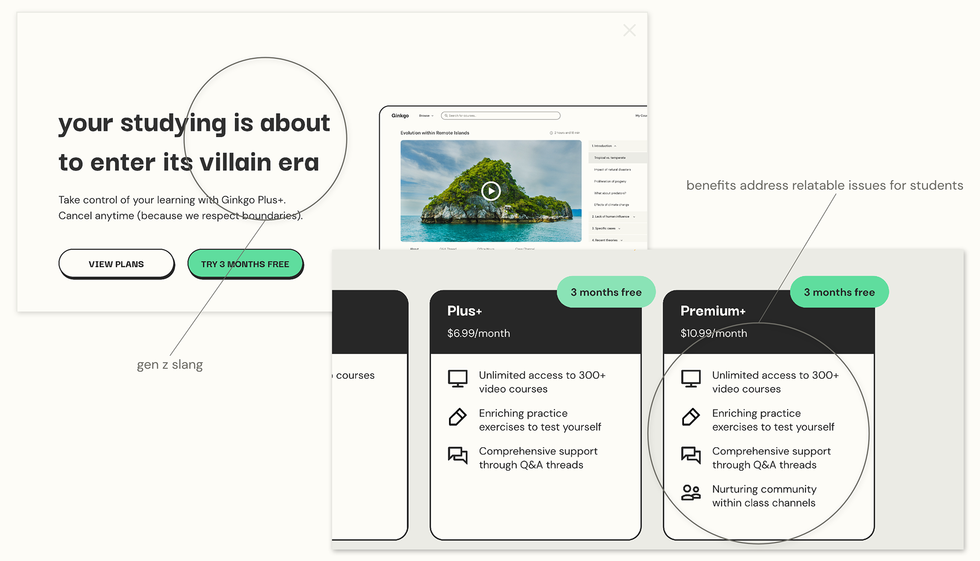
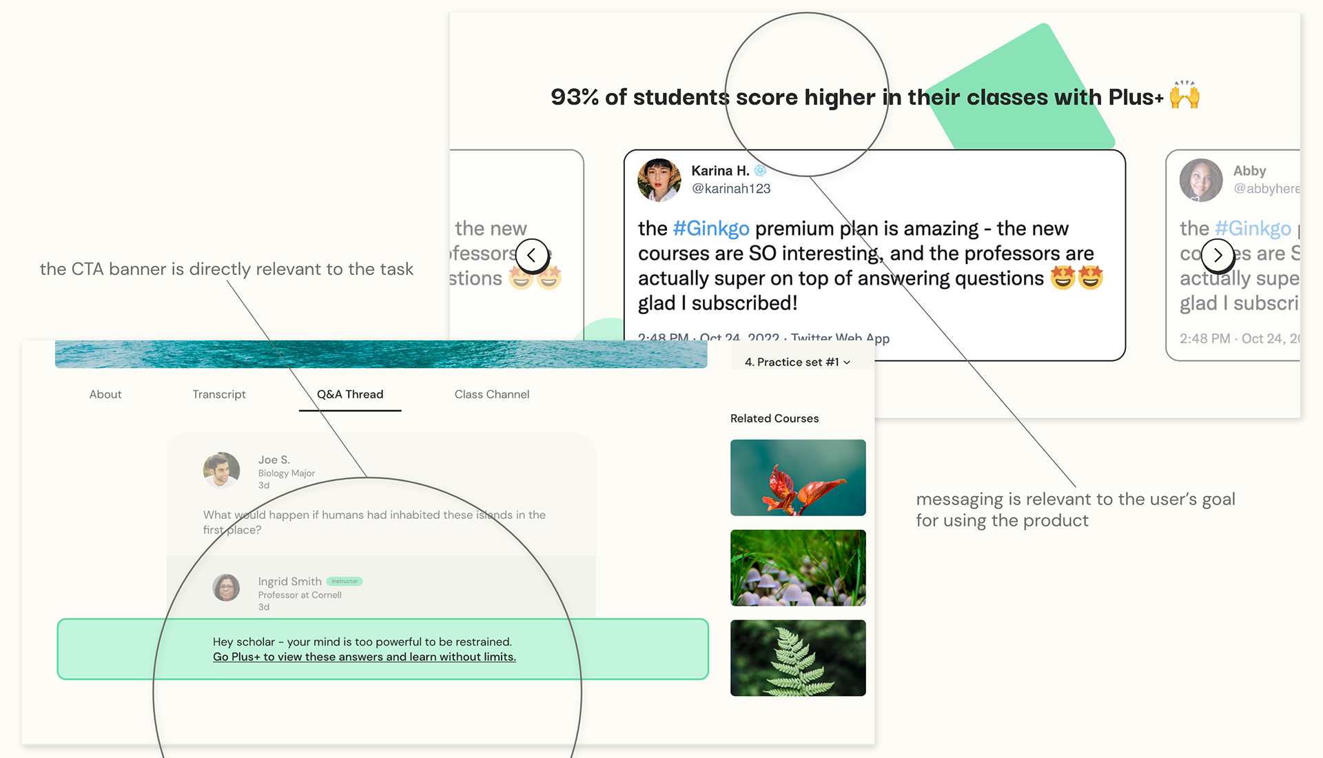
2) Make it relevant.
To be effective, the CTA should be both relevant to the user's task at hand, but also to their overall goals when using the product.
3) Make it clear.
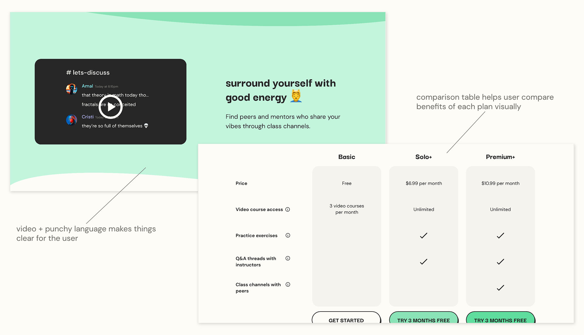
Visual examples and concise language make the benefits of the plan clear and easy to understand quickly.
Process
Competitive Analysis
To understand how e-learning companies succeed with the freemium model, I researched three websites: Coursera, Codecademy, and DataCamp. I evaluated:
1. How effective premium CTAs were within the registration flow,
2. How effective premium CTAs were while using the free version,
3. If premium appears better than free.
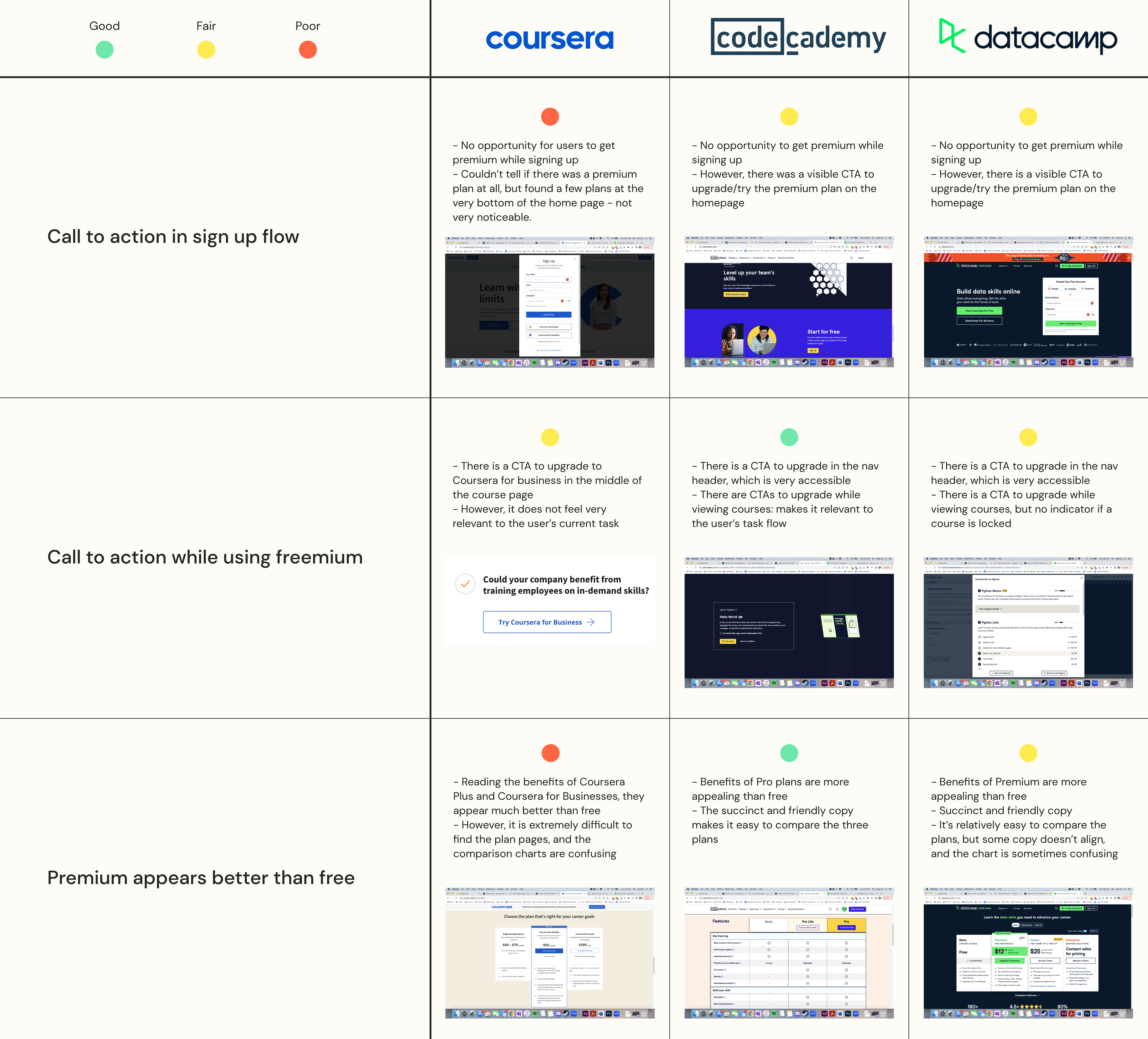
I had three main insights from my analysis:
1) Include a CTA during the sign-up
Dedicating a premium CTA in the sign up flow helps inform the user.
2) Stay relevant
Premium CTAs are effective when they are relevant to the user’s task.
3) Make it easy to read
Succinct, organized, and friendly copy grabs and keeps users’ attention.
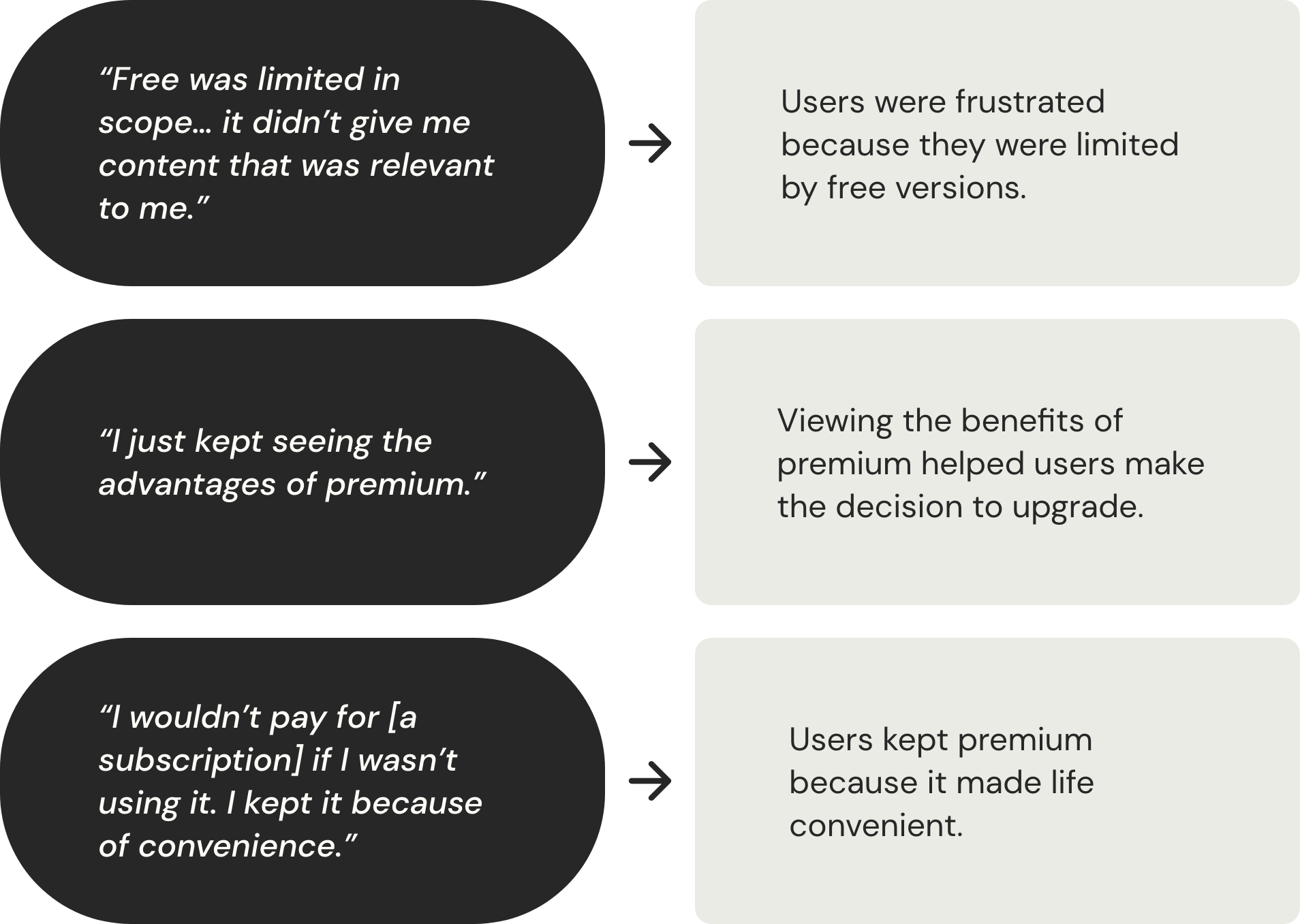
User Interviews
Next, I conducted user interviews to hear about what enticed them to subscribe to premium while using freemium products, and about their experience with e-learning products. As Ginkgo's video courses are for college students, I recruited students through my university network.
Affinity Map
After collecting data from primary research, I created an affinity map to organize all the information and discover deeper insights.
One of the challenges for this portion was that some quotes did not seem immediately related to subscribing to premium – i.e., what users liked about in-person classes compared to virtual. Working with my mentor, I found that these quotes shed light on which e-learning features were actually relevant to students. Hence, they were essential for crafting the copy for the CTA screens. So, I incorporated them into the map as a sub-group.
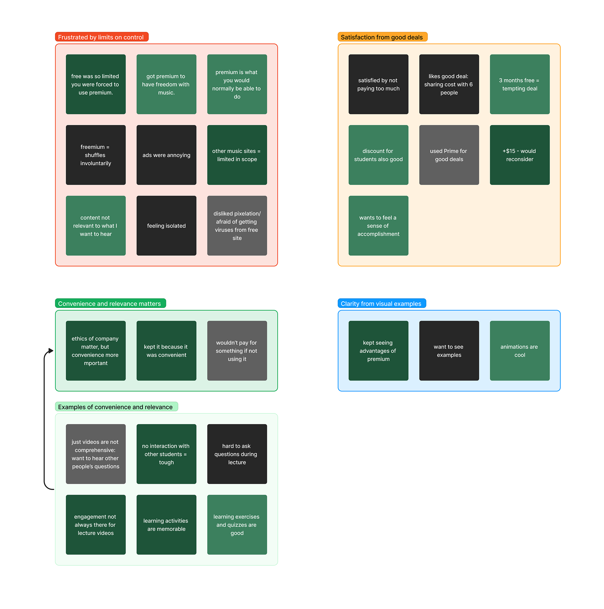
The map revealed 5 important insights:
1) Limits on control
Users are frustrated when freemium products limit their control.
2) Good deals
Users feel satisfied when they find good deals for premium.
3) Visual examples
Visual examples give users clarity about premium benefits.
4a) Convenience and relevance
Convenience and relevance drive a user’s decision to keep using premium.
4b) Examples of convenience and relevance ↑
Interaction, engagement, and exercises are convenient and relevant to a student’s learning experience.
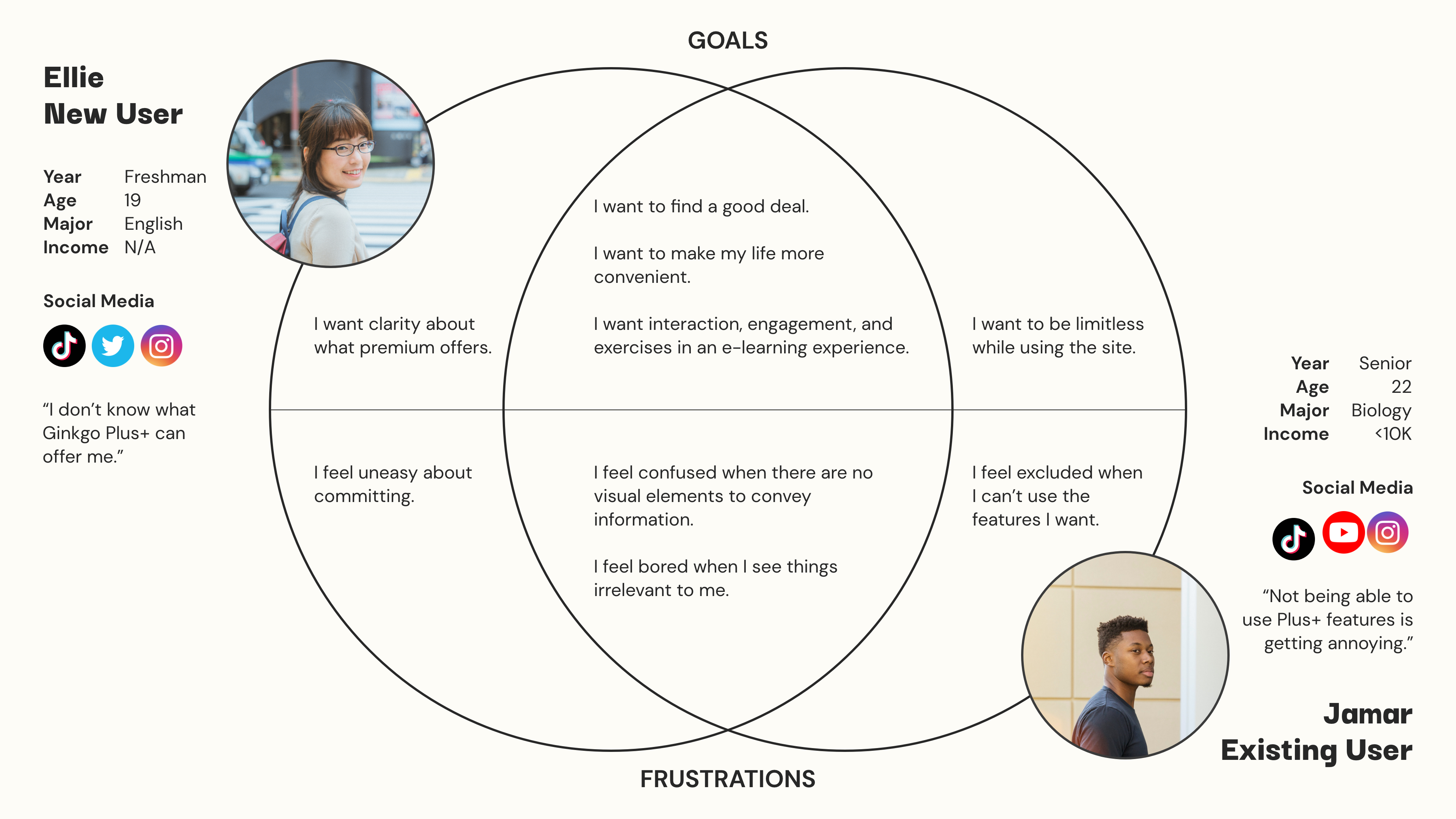
Personas
Using my insights, I created personas to put a face to my users, and to empathize with their goals, frustrations, and feelings. This was likely the most important step for this project, because CTA screens speak directly to users. I created every element within the solution thinking about how to relieve Ellie and Jamar's pain points and help them achieve their goals.
These were my two user types: Ellie the new user, who wants to understand how premium can benefit her, and Jamar the existing user, who wants to go beyond the limits of the free version.
User Flows
Understanding the problem allowed me to begin thinking about solutions. I created user flows to model the user's path through the site and determine when an upgrade CTA would be most effective.
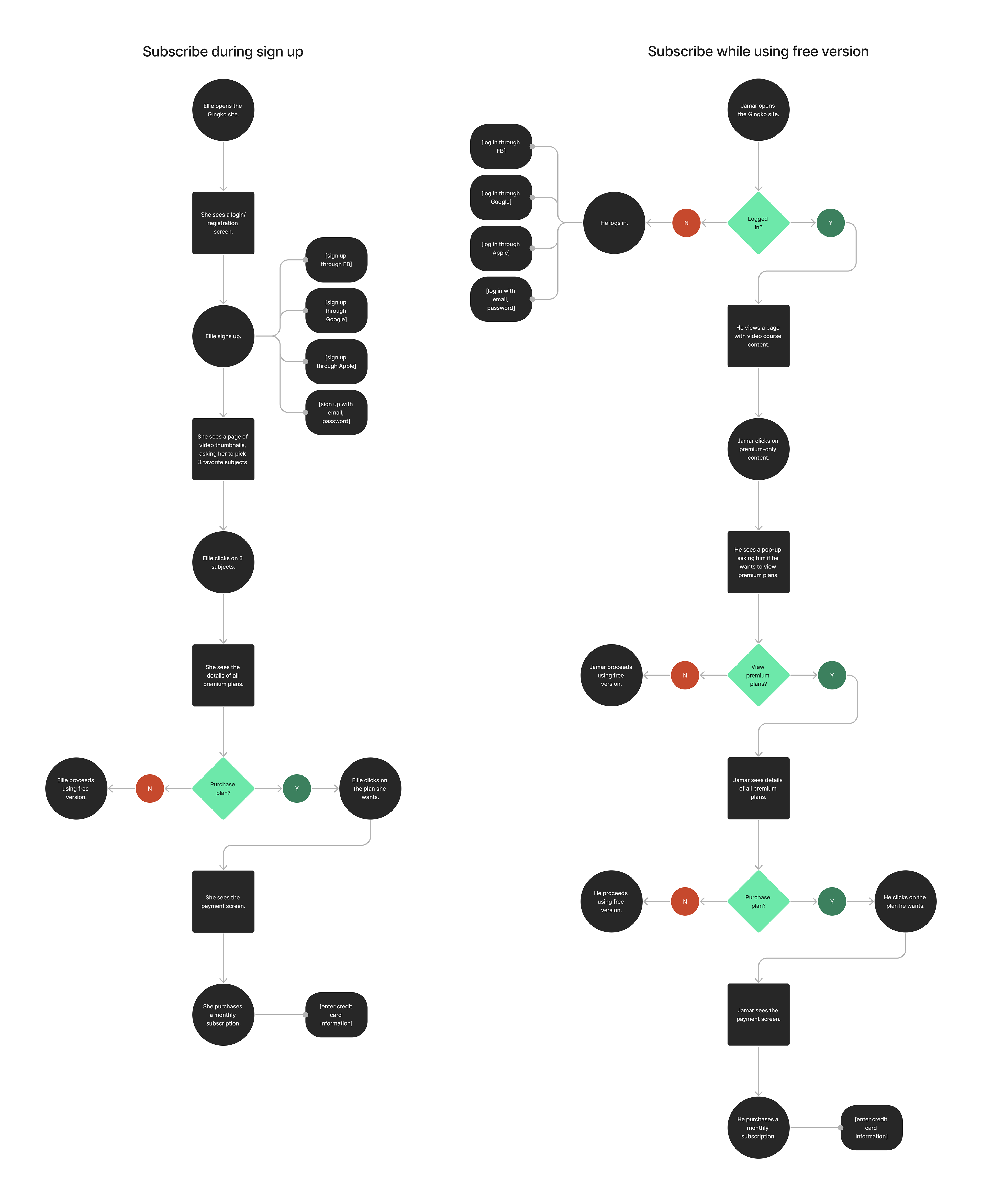
Ellie (new user)
Encounters a CTA/promotion page explaining premium benefits right after signing up.
Jamar (existing user)
Encounters CTA banner in the middle of doing a task within the free version.
Wireframes
To brainstorm the layout and functionality of the solution screens, I was tasked with creating wireframes for both Ellie and Jamar's user flows.
As she scrolls through the informative panels on this page, Ellie can gain clarity about Ginkgo Plus+. I created three versions of the screen, and worked with my mentor to construct a final version.
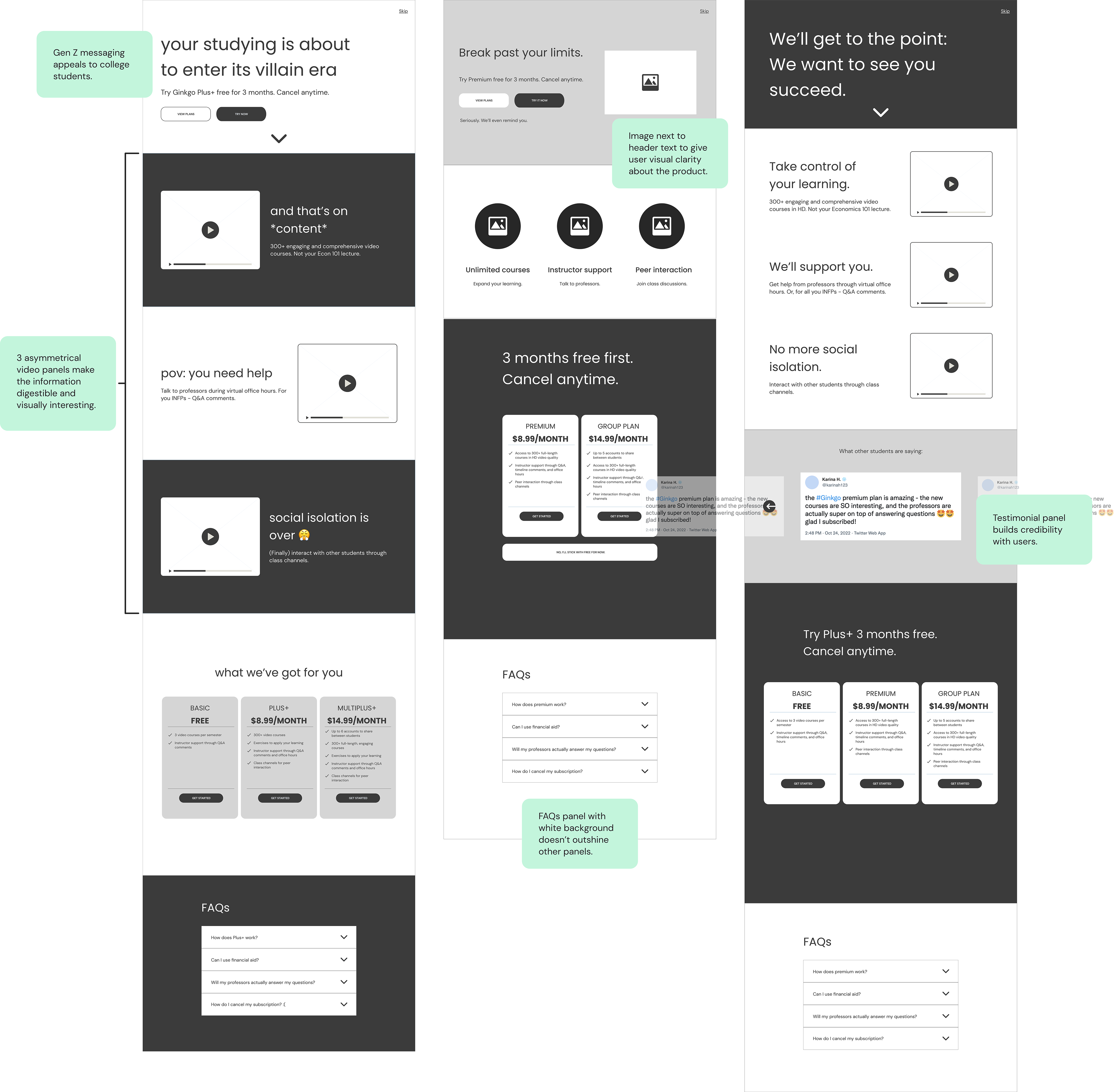
As Jamar views his course videos, the CTAs below give him a convincing and easy way to subscribe. The banners are placed in noticeable locations, and the Gen-Z language appeals to him, as if he was talking to a friend.
Researching Gen Z Slang
I took special care when crafting the copy. The language had to be humorous and trendy to appeal to Ellie, Jamar, and Gen Z college students. My mentor and I dove into TikTok, YouTube, and Instagram to understand the most recent Gen Z jargon and incorporate it into our solution.
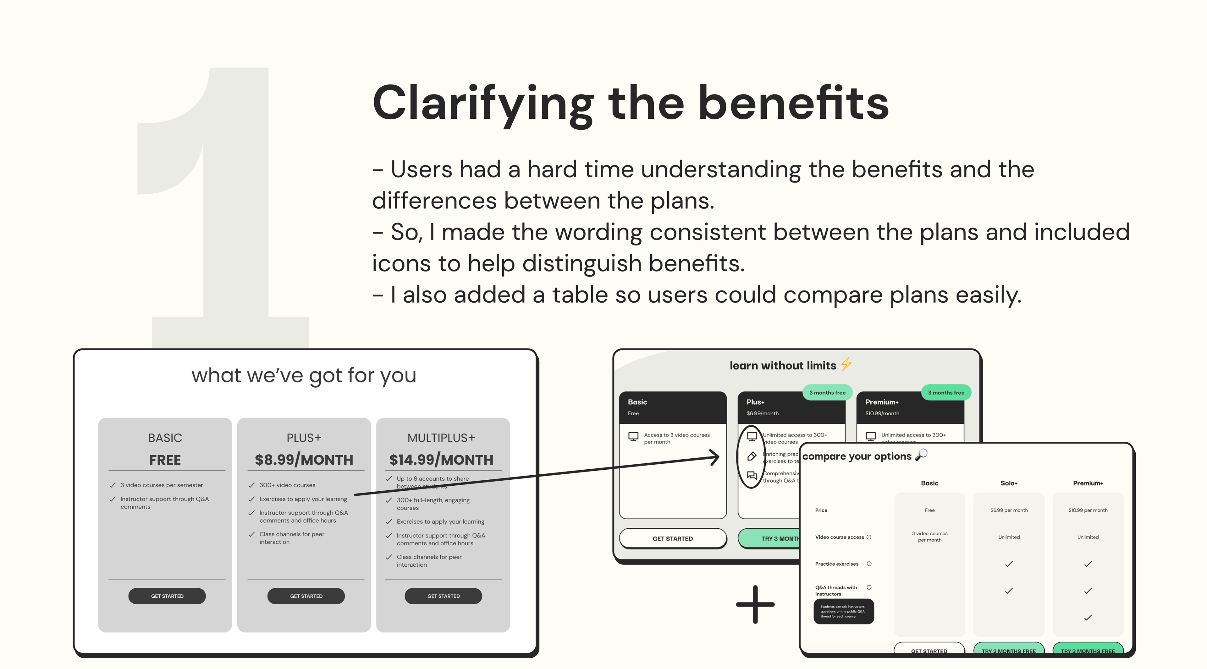
Usability Testing
After I created initial drafts of the high-fidelity screens, I went forward with usability testing in order to see if the screens had their intended effect – to grab users' attention and give clarity about the premium plans. After receiving user feedback, I made 3 major improvements:
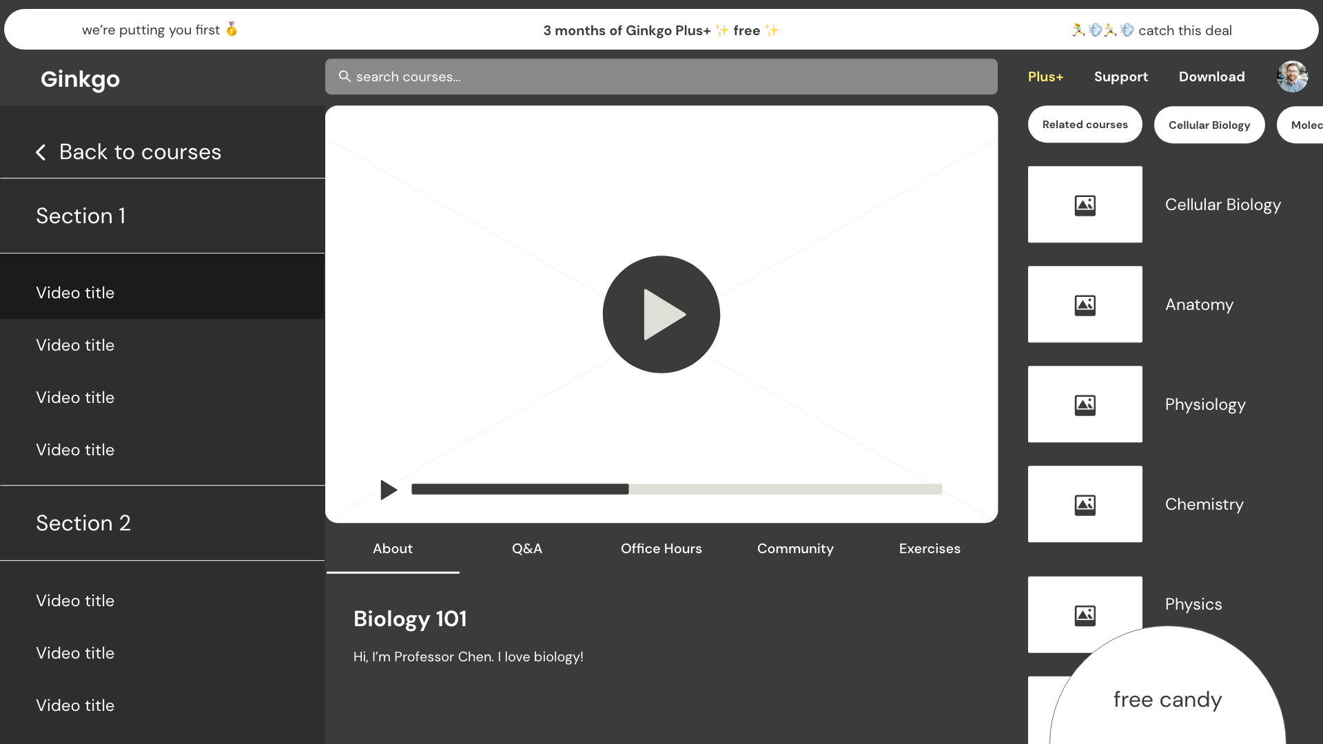
Final Product
Impact
Greater relevance and clarity 💆🏻♀️
After the final round of testing, I found that more users felt that premium was applicable for their needs, clearly understood the benefits, and interacted with the upgrade CTA on the video course screen! 🥳
Lessons
Empathizing with the user 👯
Gen Z is extremely tech-savvy and familiar with internet marketing ploys! We had to focus on designing for humans – speaking their language, making things clear for them, and respecting their digital space.
Challenges
Tailoring the copy to the user 💬
Gen Z is quick to determine what is trendy, and what is outdated. There is a fine line between the two, and to avoid the latter, I had to conduct in-depth research by watching TikToks and YouTube videos, and by reading comments and articles.
Next steps
Further testing 📝
Next steps for this project would be to test usability with eye-tracking software. This would tell us if users are looking where we want them to look. Furthermore, if those tests indicate that different colors and layouts could work better, we might conduct A/B testing for conclusive results.