Starboard
Improving the experience of patients searching for therapists
Starboard was a solo project done to explore current problem spaces within mental healthcare, particularly why it was so difficult for mental health patients to find therapists. I spearheaded the UX/UI design process under the guidance of a senior design mentor.
90%
of users found Starboard to be easier to use and more elegant than Psychology Today, the leading therapist search website.
+26%
was the increase in task completion rate from the first usability test to the last.
Context
Team
1 designer, 1 senior design mentor
Responsibilities
I was responsible for user research, brand design, UX and UI design, and usability testing, and iterations. Senior designer Farid Shukurov advised on my deliverables.
Timeline
12 weeks (spring 2022)
Problem
Navigation and support
Mental health patients have trouble finding therapists who are available and suit their preferences.
Therapists are not always transparent with information, so users have to jump through hoops to contact them. Constant rejections make it difficult for patients to stay motivated to search.
Solution
Comprehensive search experience
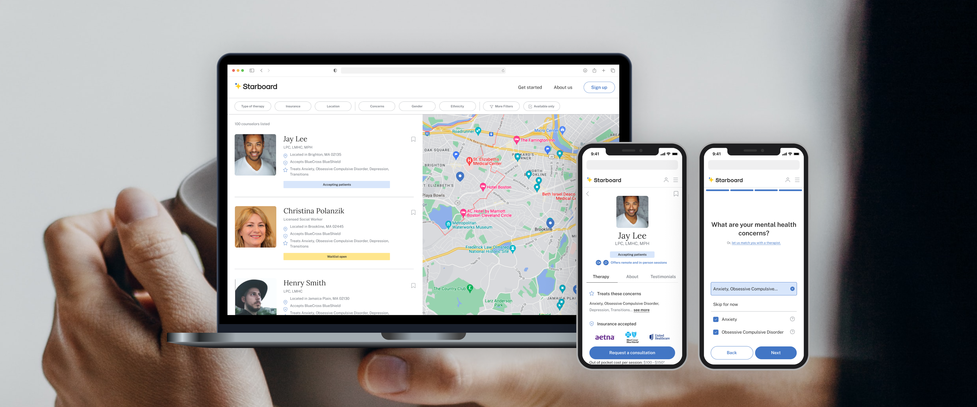
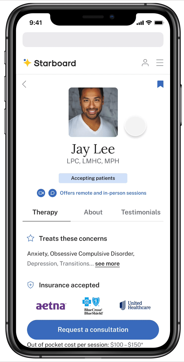
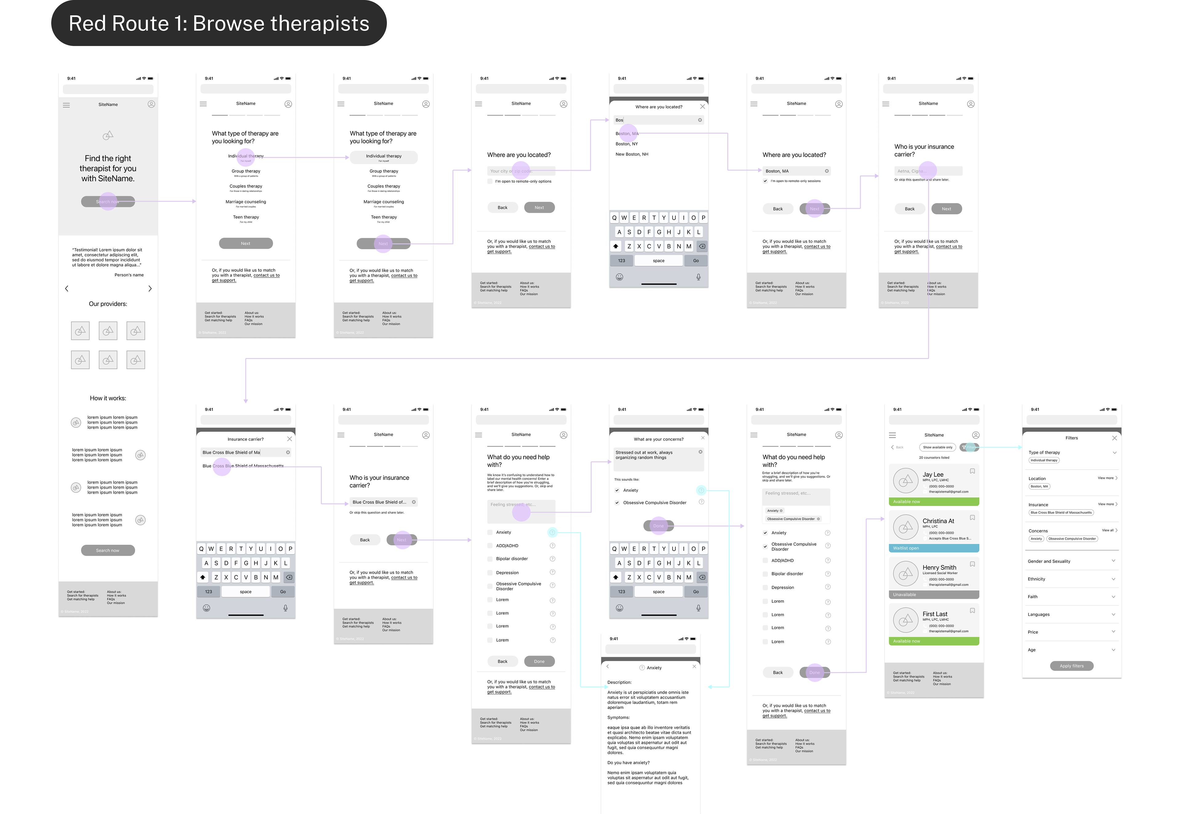
1) Navigate search with filters
Filters help users quickly express their preferences for a therapist they feel most comfortable with.
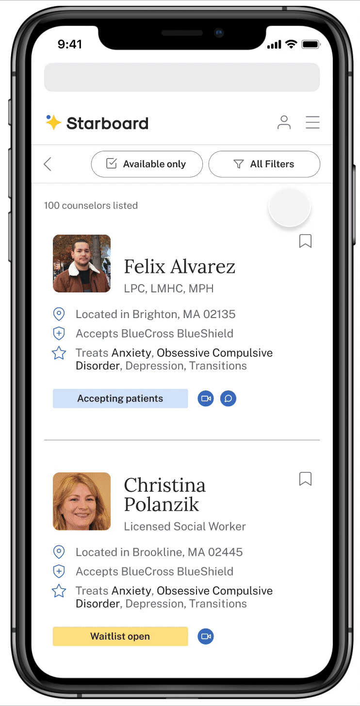
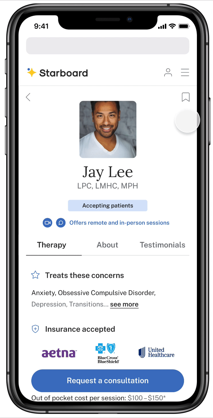
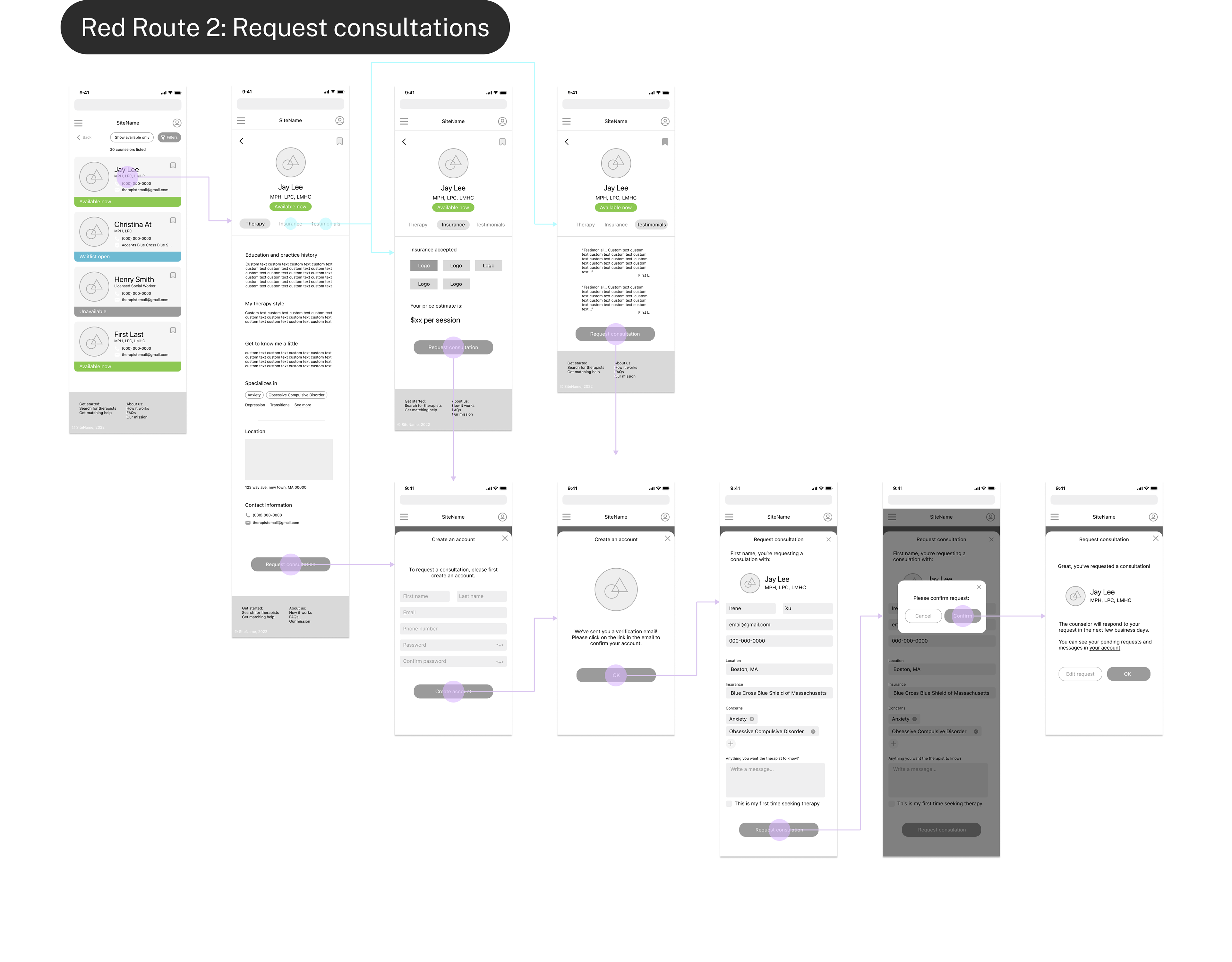
2) Bookmarks and consultation requests
Users can bookmark therapists help them keep track of their progress, and can easily request a consultation to get in touch.
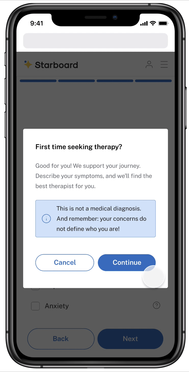
3) Describe mental health concerns
Users can type in symptoms and choose suggestions from Starboard. They can also read a description of a particular condition, helping them understand their concerns better.
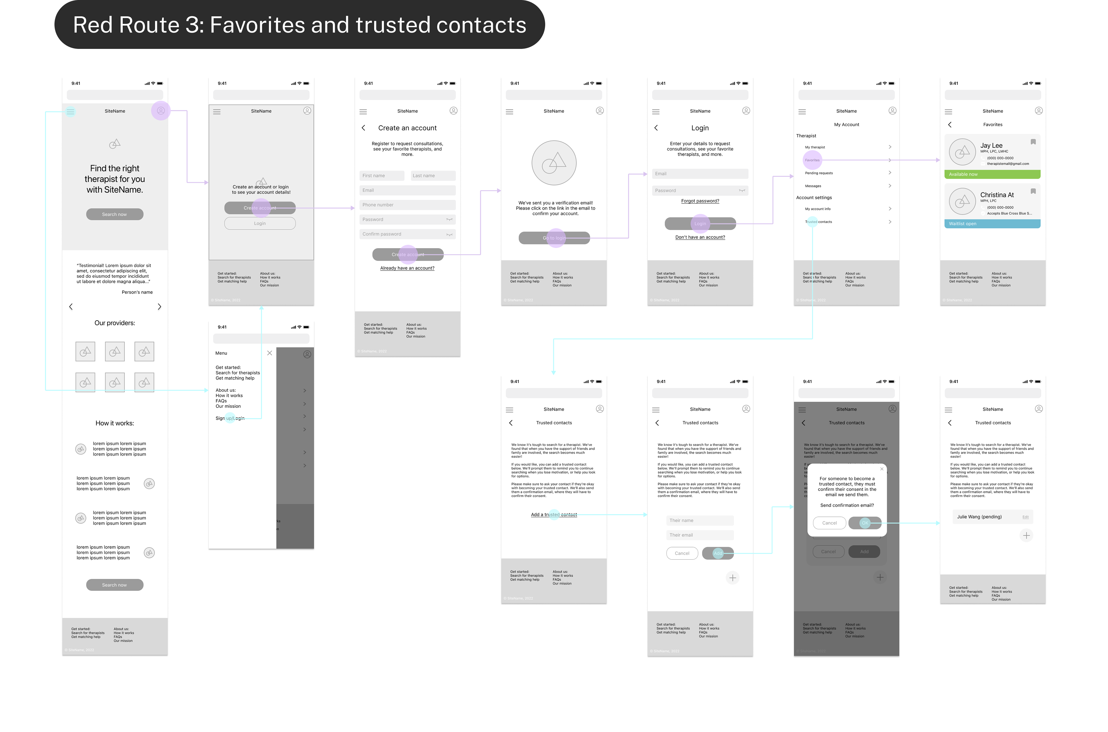
4) Connect users with trusted friends
Users can request their close family and friends to become "trusted friends". If the user becomes inactive for a few months, Starboard will send email reminders to the trusted friend, suggesting that they encourage the user or help them search for a therapist.
Research
Options are limited
My white paper research showed that societal factors impact available resources.
A few key issues include:
Availability: The demand for therapists exceeds the supply, so there are less available therapists.
Finances: Sessions can cost up to hundreds of dollars if patients don't have the right insurance.
Demographics: Many patients seek therapists with diverse backgrounds, which shrinks the available pool.
Competitive Analysis
Opaque and disjointed search experience
Upon looking into three current industry solutions, I found that search sites don't provide the transparency patients need.
Sites didn't adequately display therapists' availability, and in some cases, users weren't able to request or schedule appointments. Users had to leave the website to do extra research and request consultations, making for a disjointed experience.

User Interviews
Need for credible support
The users I interviewed didn't fully understand their mental health conditions, and felt vulnerable reaching out to therapists when there was no transparency about availability.
At the same time, they more successful when they received support from credible sources like friends, family, and healthcare professionals.

I remember I had to Google, like, "what is anxiety"? Do I fall into this category?

I really needed help, but… in those moments when you need it the most, you're the least willing and able to do it yourself.
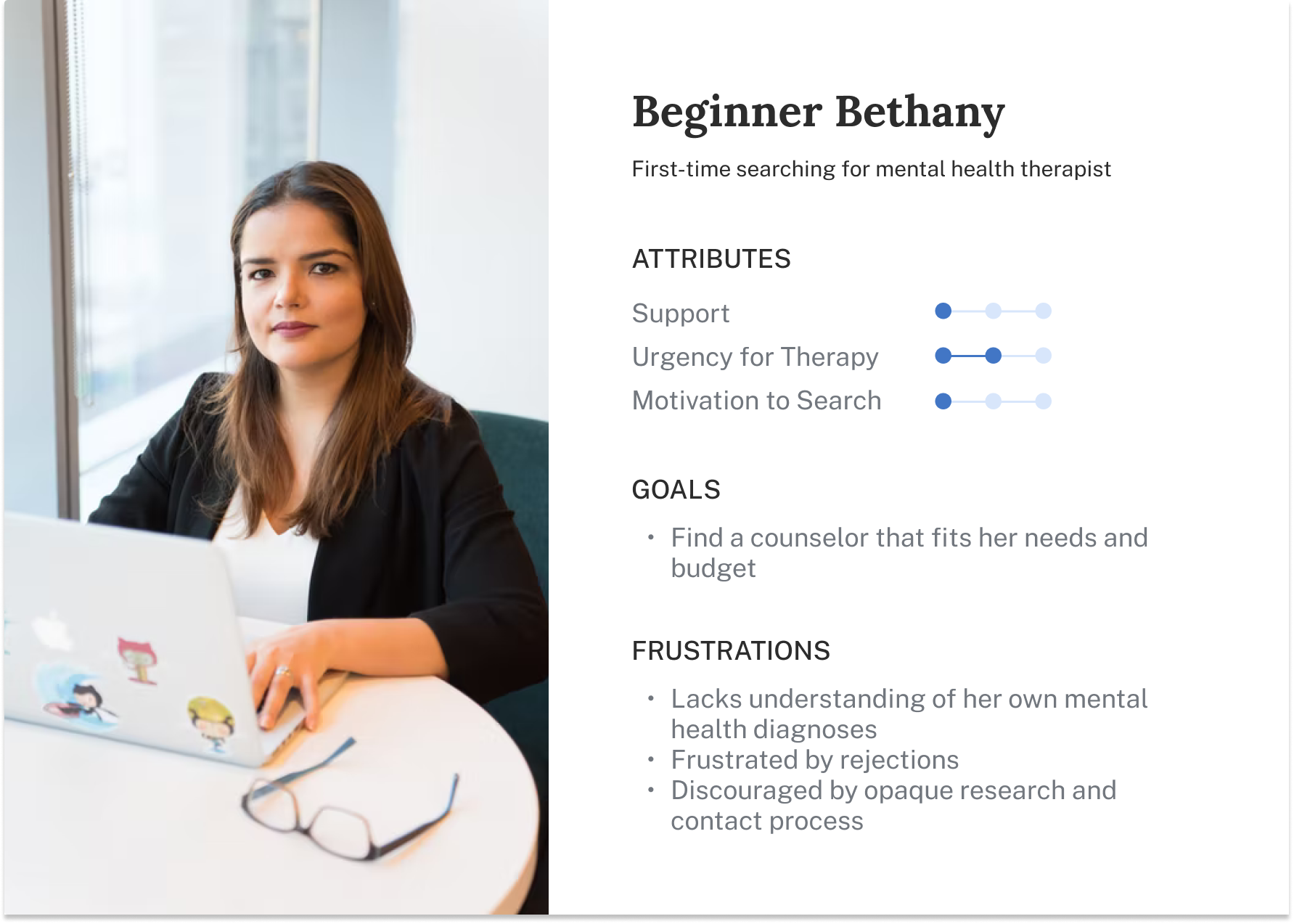
Bethany needs help with navigation and motivation!
I created a persona to help consolidate my understanding of users goals and frustrations so I could refer back to her during the design process. I focused on Bethany, who is searching for a therapist for the first time.
Discovering the two problem spaces
Navigation
Motivation
Bethany wants to find a therapist that fits her personal needs and budget, and understand her mental health concerns more clearly.
Bethany needs motivation so she don’t fall into discouragement, specifically from her friends and family.
Ideation
How Might We...?
To guide the ideation process, I asked myself a few "How Might We" questions:
1) HMW efficiently guide patients towards therapists that fit their preferences and needs?
2) HMW increase access to credible support for patients during their search?
1) How might we efficiently guide patients towards therapists that fit their preferences and needs?
I created user stories to understand what functions would provide Bethany the most value when searching for a suitable therapist. Then I made some sketches to brainstorm different options.
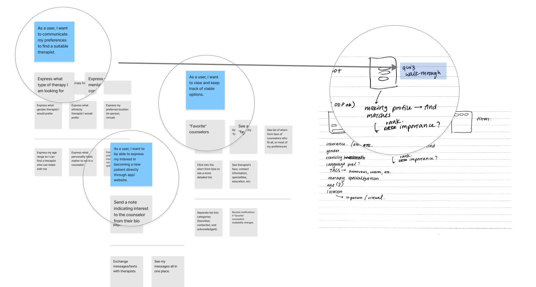
I weighed the pros and cons of potential solutions:
Quiz ✓
Walking the patient through specific questions feels more personal and provides intentional guidance.
Chatbot ✗
Chatting with a helper can give patients the ultimate "interpersonal" experience, but compromises on speed and user control.
Filters ✓
Filters provide speed and user control, but don't feel as personal. However, filters can be combined with the quiz to achieve this effect.
Schedule consultation ✗
A scheduling feature provides the most comprehensive guidance. However, it requires Starboard to hire therapists and exert control over their schedule, limiting the available pool.
Request consultation ✓
A request feature gives adequate guidance to users, and allows for therapists not strictly hired by Starboard, giving patients more options.
Bookmarks ✓
Bookmarks help patients save their options and track their progress, providing expected guidance and functionality.
2) How might we increase access to credible support for patients during their search?
I referred back to Bethany and brainstormed solutions that address her frustrations of guidance and support. My mentor helped me decide on the best ideas — particularly features that gave Bethany a uniquely tailored experience.
I narrowed down the potential solutions:
Involving trusted friends ✓
Bringing in family and friends to help the patient search has been proven successful, so a feature that loops in these people would be ideal.
Support group chat ✗
A group chat could be a good space to give and receive encouragement, however, it doesn't directly address the goal of finding a therapist.
Summary of symptoms ✓
Being able to describe one's experience and seeing a summary of mental health symptoms provides crucial guidance and clarity while maintaining speed and efficiency.
Video description of symptoms ✗
A video describing symptoms could provide more clarity to confused users, however, this would compromise speed for more experience patients. Ultimately, it didn't feel necessary to the MVP, but is a feature that could be developed later on.
Design concept
Implementing smooth user flows
Having brainstormed possible solutions, it made sense to map out wireflows to portray the critical paths Bethany would take to achieve her goals. This ensured that my solution would have a logical sequence going forward.
Testing
Improving information hierarchy
After I had an initial prototype, I conducted usability testing to ensure that the task flows were intuitive to the user, and to resolve any areas of friction.
1) Making information accessible
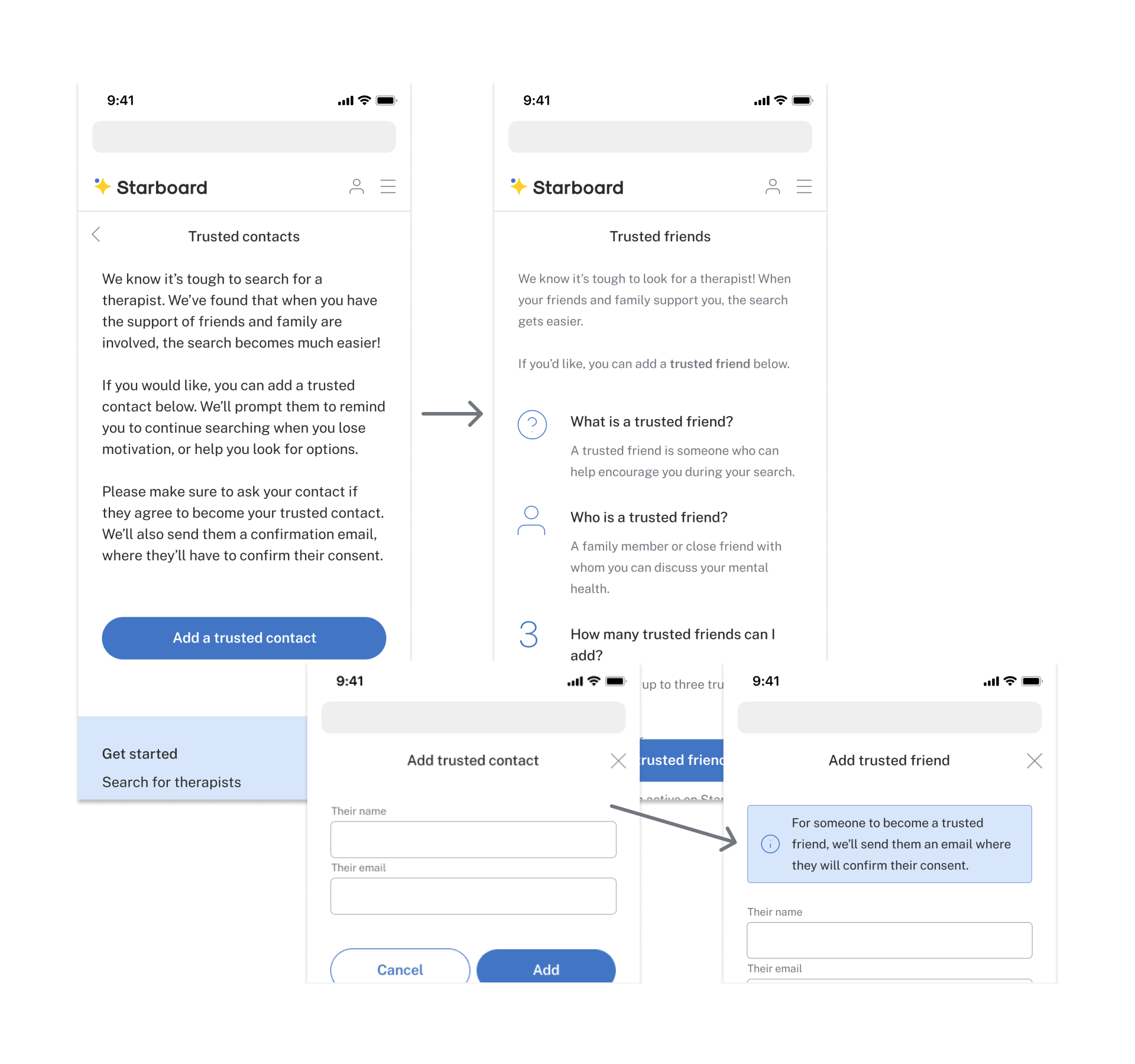
• Users didn’t understand how the “trusted friends” feature worked.
• So, I spaced out the text and included icons to improve readability.
• I also placed important information in more visible locations.
• So, I spaced out the text and included icons to improve readability.
• I also placed important information in more visible locations.
2) Prioritizing desired information
• Users wanted to see specific information first.
• I prioritized showing remote/ in-person options from therapists in the bio.
• I also prioritized showing treatment specialties and insurance information.
• I prioritized showing remote/ in-person options from therapists in the bio.
• I also prioritized showing treatment specialties and insurance information.
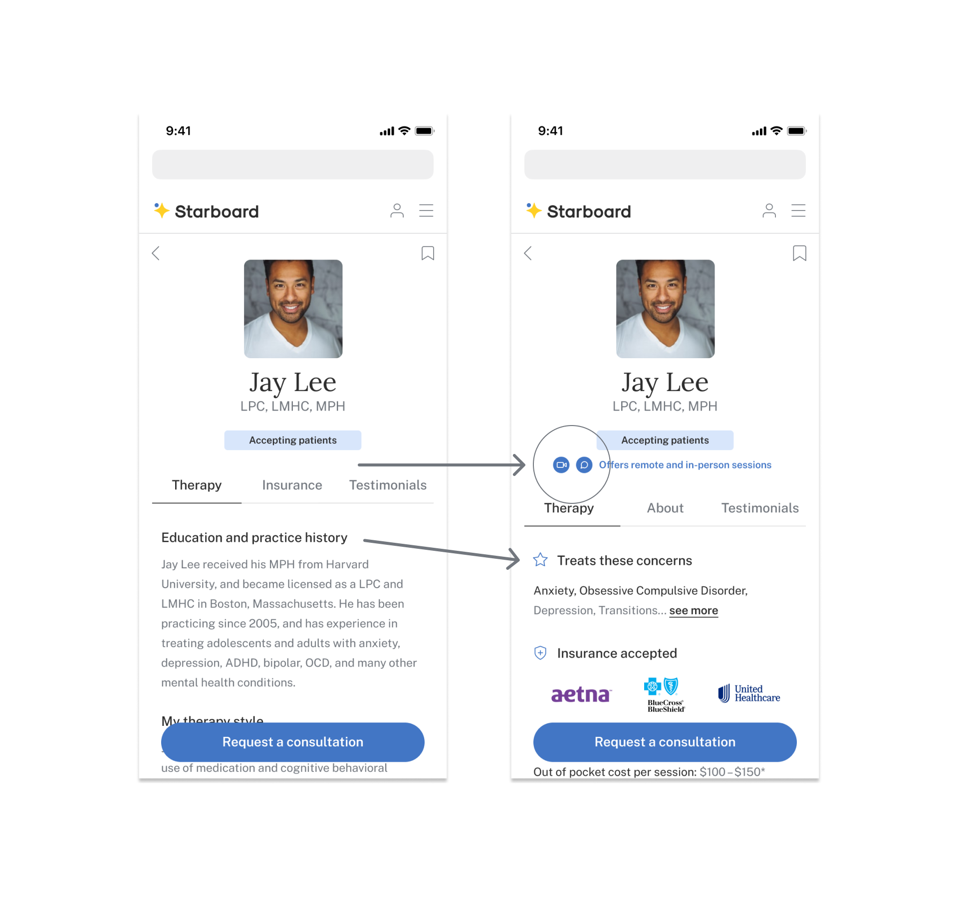
3) Matching user expectations
• Users had expectations for what would appear when clicking certain buttons.
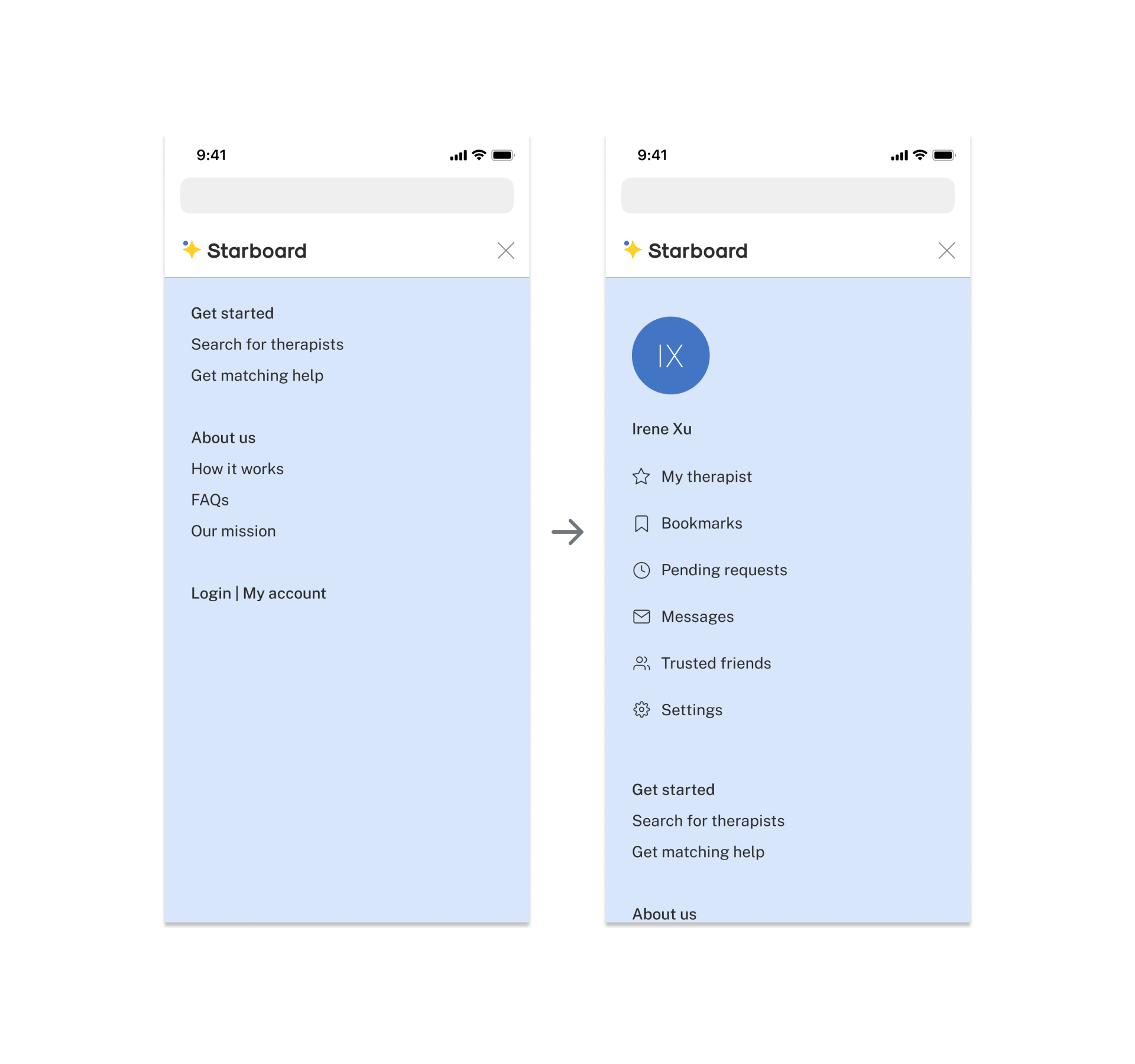
• i.e. Some users thought that the menu should include certain pages like “bookmarks”. So, I included them in the menu.
• i.e. Some users thought that the menu should include certain pages like “bookmarks”. So, I included them in the menu.
Final Prototype
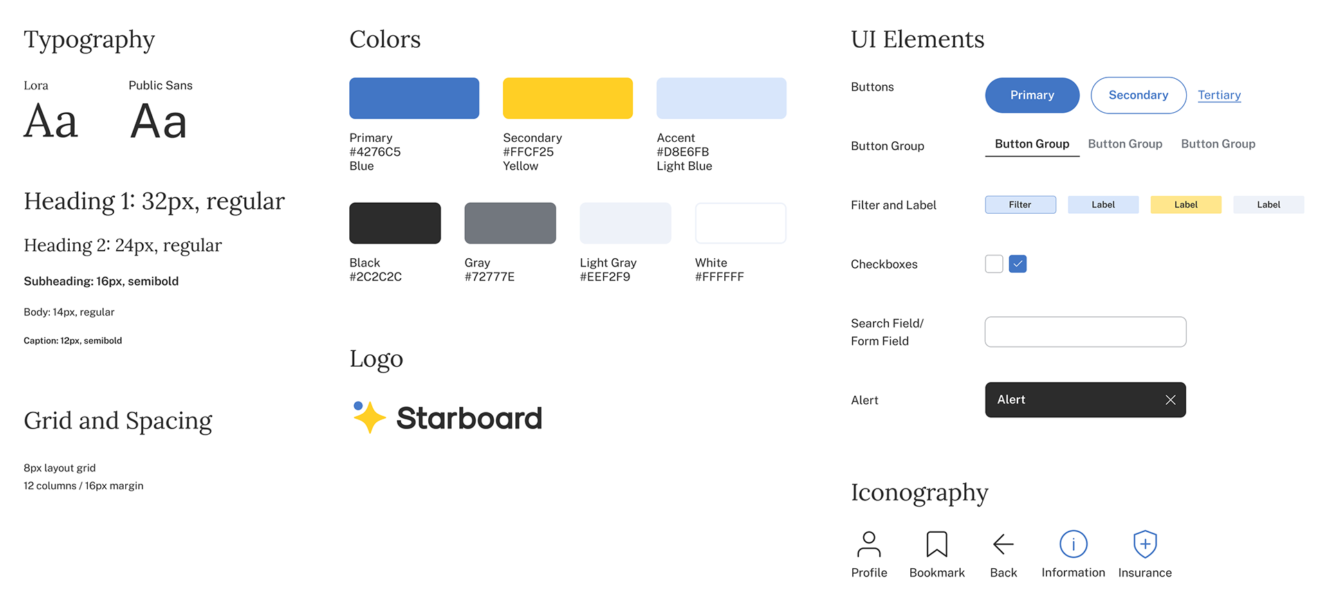
Style Guide
Takeaways
What did I learn?
Lessons
Granular iterations... ✍️
Solutions needed to be refined through usability testing and adjusting details. For example, after piloting the trusted friends feature, I found that users didn’t actually understand its function! I worked this out by breaking informative text into chunks and adding icons.
Challenges
Watching and listening to the user 🧐
It was hard to continuously pay close attention to their words and actions. Sometimes my bias towards my own solutions would tempt me to ignore feedback... however, I would definitely feel unsettled when this happened. I learned to address that discomfort and revise the solution, because the user truly knows best - it's their experience, after all!
Next steps
Design for the providers! 🩺
The next step would be to explore the provider side. I would need access to resources that provide interviews with professional therapists. This would have made it possible to develop secondary features, such as sending messages and signing up for waitlists.