Kanban Zone
Redesigning content and structure to strengthen key conversion points

Kanban Zone is a productivity board software that helps teams organize tasks, facilitate collaboration, and measure progress. Our task was to redesign the homepage and highlight key conversion points, with the goal of promoting the product rather than educating their users.
+20.6%
was the increase in user engagement on the homepage.
4/4
was the satisfaction rate among stakeholders.
Context
Team
2 designers, 1 developer, 1 business executive
Responsibilities
I was in charge of primary user research and designing the UX/UI design for the desktop version. I conducted user interviews and delivered sketches, wireframes, and high-fidelity mockups. (My partner worked on competitive analysis and UX/UI design for the mobile version.)
Timeline
4 weeks (winter 2023)
Problem
Lack of focus and intention
Users aren't acknowledging the product's unique benefits.
KZ's homepage had no good visual examples of the selling points, and users were confused by why they should choose KZ over other kanban software. The experience of scrolling was clunky, with inconsistent colors and lengthy text.
Solution
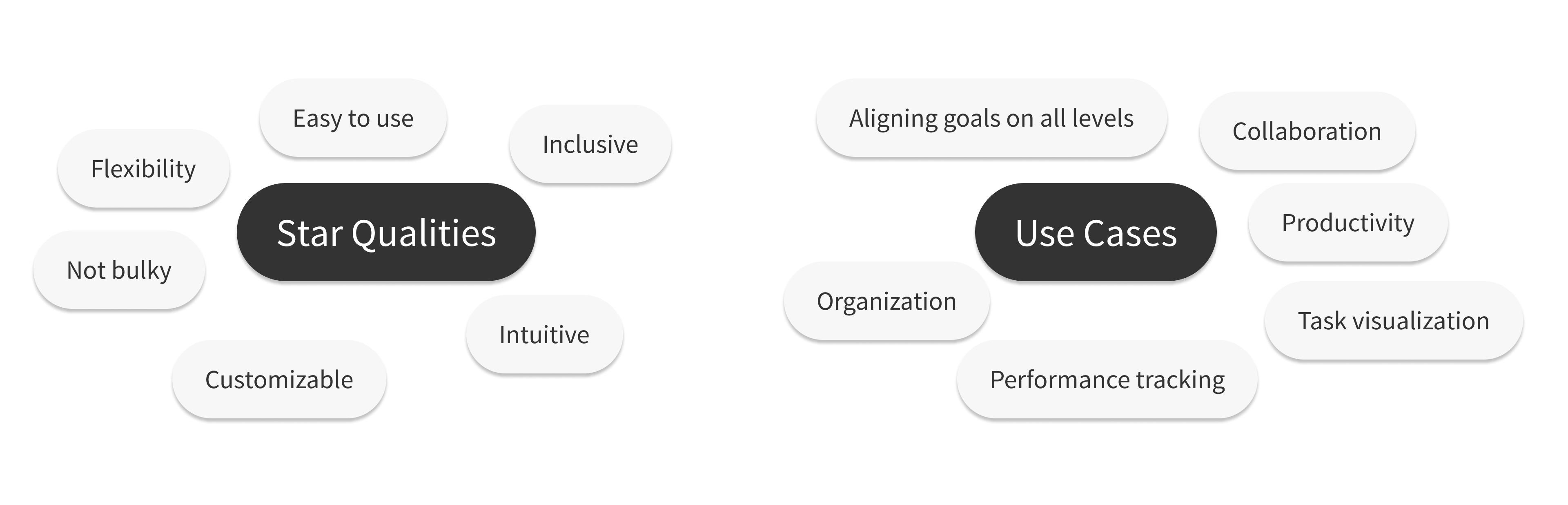
Highlight offerings and build trust
1) Highlighting KZ’s core offerings in action
Since users were confused about the product’s unique benefits and what it looks like in action, it made sense to highlight the 3 most convincing reasons why they should buy the product and include visual examples.

2) Demonstrating how KZ shines
Users wanted to know how the product is different from the competitors. They can view key factors that set KZ apart with an easily scannable table.

3) Building users’ trust
Clunky UI caused users to question whether KZ was a reputable product. The solution features consistent colors and design elements, and highlights notable customers, quotes and awards to prove Kanban Zone’s respectability.

Process
Primary Research Findings
To get a look into users' experience with the original homepage and the issues they ran into, I conducted user interviews with participants who were familiar with using collaboration software.
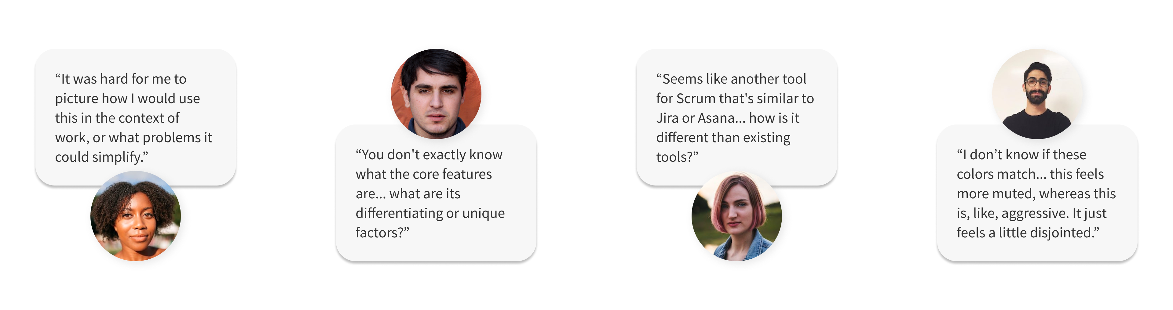
1) Users weren’t sure why Kanban Zone was special.
The participants had used kanban boards before, and they didn’t understand how this product brought something new to the table
2) It was unclear what Kanban Zone looked like in action.
The page emphasized abstract concepts with images, but users still didn’t get how the product worked in real-time.
3) The clunky UI caused users to distrust the product.
The page displayed lengthy text and inconsistent colors, causing users to doubt if KZ was reputable.
Copywriting
Since part of issue with the homepage was with conveying key information, I realized that concise and impactful copywriting was essential in helping users understand KZ's core offerings. The best way to do that would be to interview KZ users, but our timeline didn't allow for that. As a workaround, we gathered insights from testimonials and personas to understand the product's best features and functions, and brainstormed copy from that research.

Design Explorations
I made a few pen-and-paper sketches to generate ideas for the layout of the homepage for desktop.

There were two overarching themes from these sketches:
1) Visual examples give clarity and spark interest.
Show, don’t tell, the user what they want to know. It’s easier on their eyes and on their attention span.
2) Give the user some breathing room.
Reduce clutter, but don’t strip the page bare. Even spacing lends to orderliness and helps the user stay focused.
Wireframes
I then translated these sketch ideas into wireframes, were meant to provide a solid foundation for the high-fidelity screens. This would help us design efficiently.
This step was challenging: my partner and I had different ideas for elements to include. We had to compromise and listen to each others' reasoning to understand how that idea really solved users' issues with the homepage.

We worked together to finalize the wireframes shown as screens 5 (desktop) and 6 (mobile).
• We included elements such as the comparison table and media panels because they would help potential customers understand Kanban Zone's core offerings and set them apart from the competition.
• We decided to take off the video because it wasn't likely that users would want to commit the time to watching a video while just quickly scrolling through a home screen.
• We included company logos, testimonials, and awards at the end to build up the users' trust in the company. I initially disagreed with the layout and wanted to include logos at the top to draw the users' attention right away, but discussed with my partner and came to the conclusion that keeping the "trust-building elements" together would allow for a more consistent experience.
Adjusting for business and development goals
I continuously iterated my hi-fi designs over two weeks based on user feedback and team reviews. The major challenge was defending my design to the client – I had to advocate for users by pointing back to the research and showing how our designs fixed their issues, while also accounting for business goals and development limitations.
This resulted in a few pivots and adjustments to the design:
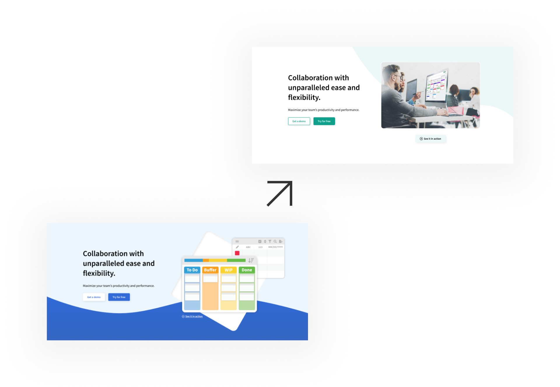
1) Replaced hero image
• Replaced the graphic with a photo of people using the product in order to fit the image of the company as professional and welcoming.
• Moved the wave element to the top in order to guide the users' eye downwards to the rest of the page.
• Adjusted the colors to Kanban Zone's original color palette to save time and cost.
2) Remodeled ‘types’ section
• Changed the orientation to vertical to encourage users to scroll down.
• Illustrations spark joy more than icons do :)
• Included background cards indicate that the elements are interactive.

3) Added ‘watch video demo’ option
• Due to the timeline, my partner and I weren't able to create high-quality graphics or animations of the product. We needed another way to show the product in action.
• Added a “watch video demo” link so the user could see the product in action.

Final Mockup

Impact
What did I learn?
Takeaways
Client goals vs. user needs 👀
During our weekly check-ins, I found that the client preferred stick to the status quo and pushed back at my ideas – but this wouldn't solve user issues. I had to really advocate for the user with research. For example, the client wanted to keep the customer company logos gray, but I argued that this had caused users to doubt whether the companies actually used Kanban Zone.
Challenges
Differences in design choices 🎨
Partnering with another designer meant making compromises! To work through our different opinions, we used active listening to really understand why we made certain decisions. For example, I decided to include section subtitles on my homepage after my partner argued that they helped guide the user.
Next steps
Dynamic elements 💥
If I were to continue this project, next steps would be to explore animation and interactive elements with the homepage – these would really give the user an insightful and delightful experience. ✨